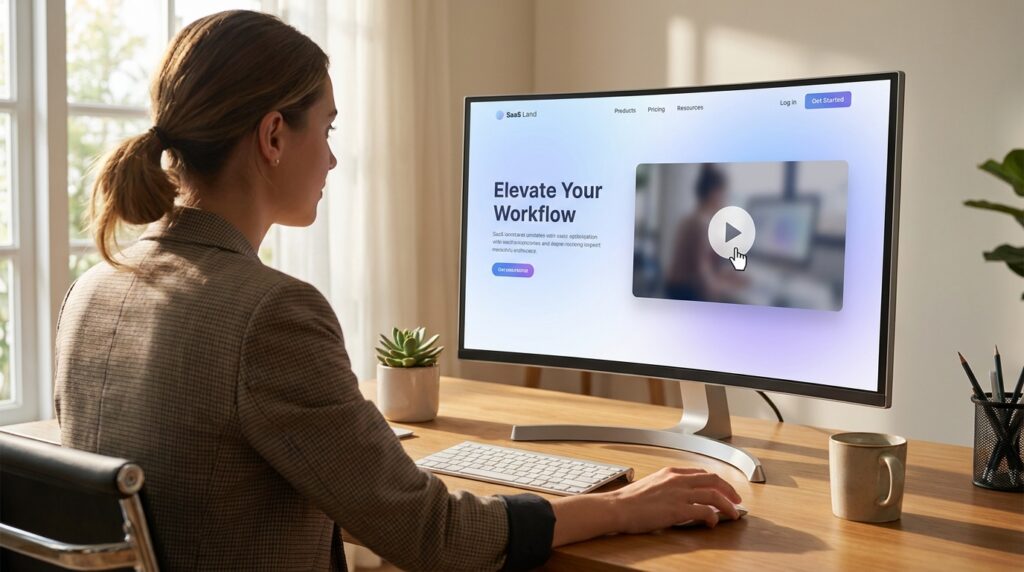
Every SaaS landing page seems to have one: a 60-to-90-second 2D animated explainer sitting right below the hero section, promising to turn a confused visitor into a signed-up user. Some of these videos genuinely move the needle on conversion rate. A lot of them just sit there, technically well-produced, quietly ignored.
Having spent years building 2D explainers for SaaS, EdTech, fitness, and healthcare clients, I’ve noticed the difference between the two categories has almost nothing to do with animation quality. Plenty of gorgeous, expensive-looking explainers convert poorly, and plenty of simple, almost plain ones outperform them. The difference comes down to a handful of structural and strategic decisions made before a single frame gets animated.
This isn’t a highlight reel of pretty videos. It’s a breakdown of what separates a 2D explainer that actually earns its spot on a landing page from one that’s just decoration.
Why 2D Animation Still Works in 2026
With AI video tools and live-action content both getting cheaper to produce, it’s fair to ask why 2D explainers haven’t gone the way of Flash banners. The answer is that 2D animation solves a specific problem better than almost any other format: it lets you show something that doesn’t physically exist yet — a software workflow, a data pipeline, an abstract process — in a way that’s clear, controllable, and endlessly editable.
Live-action video is harder to update once a product UI changes. AI-generated video still struggles with precise, on-brand product visualization. 2D animation sits in a sweet spot: fast to revise, cheap to localize, and flexible enough to represent almost any concept without needing real footage of it.
That said, “2D animation works” and “this specific 2D animation converts” are two very different claims. The rest of this post is about the second one.
What Converting Explainers Actually Have in Common
They open with the problem, not the product
The single biggest mistake I see in explainer briefs is starting with “Welcome to [Product Name].” Viewers don’t care about your product in the first three seconds — they care about whether you understand their problem. The explainers that hold attention open with a recognizable frustration: a cluttered dashboard, a missed deadline, a manual process eating up someone’s afternoon. The product doesn’t need to appear until 15–20 seconds in.
This matters more on landing pages than almost anywhere else, because the viewer is already mid-decision. They’re not casually scrolling — they’re actively evaluating whether to trust you with their time or money. An opening that mirrors their exact frustration does more conversion work than any amount of polish later in the video.
They pick one job, not five
A common instinct is to try to cover everything a product does in one explainer — onboarding, core features, integrations, pricing tiers. The result is a video that’s technically comprehensive and practically forgettable, because nothing in it lands with any weight.
The explainers that convert best usually commit to one job: get the viewer to sign up for a trial, get them to book a demo, or get them to understand one specific differentiator well enough to click through. Everything else — deeper feature explanations, pricing, integrations — belongs on the page around the video, not crammed into it.
They match pacing to intent, not to trend
There’s a temptation to make every explainer fast-cut and high-energy because that’s what performs on social. But a landing page explainer isn’t competing with TikTok — it’s competing with the viewer’s own hesitation about whether to keep reading or bounce. A slightly slower pace, with beats that let a key line of copy actually land, often converts better than a frantic montage that leaves no impression once it ends.
This is one of those decisions that’s easy to get backwards if you’re optimizing for “looks impressive in a portfolio” rather than “does its job on a real page with real traffic.”
The voiceover script does more work than the animation
Explainer videos live and die on the script long before animation begins. A well-animated video with a vague, jargon-filled script will underperform a simply-animated video with a script that speaks in the viewer’s language. The best scripts I’ve worked from read almost like a good landing page headline stretched into 100 words — plain, specific, benefit-first, with almost no adjectives doing the persuading.
If a client hands over a script full of phrases like “revolutionary,” “seamless,” or “cutting-edge,” that’s usually the first thing worth pushing back on before storyboarding even starts. Those words carry no information and viewers have learned to tune them out.
They end with one clear, low-friction action
The most common failure at the end of an explainer is offering too many choices — “sign up, book a demo, or explore our resources” — which usually means the viewer does none of them. The explainers that convert end with exactly one ask, matched to wherever they’re embedded. A homepage explainer might point to a free trial. A demo-request page explainer might just reinforce the same “book a call” button already on the page, rather than introducing a competing action.
Where 2D Explainers Fit by Industry
SaaS. This is the category most people picture when they think “explainer video,” and for good reason — abstract software workflows are exactly the kind of thing 2D animation visualizes well. The trap to avoid is over-illustrating the UI. A stylized, simplified representation of your product usually communicates faster than a pixel-accurate mockup, which tends to read as a screen recording pretending to be animation.
EdTech. Explainers here do best when they center the learner’s experience rather than the platform’s feature set — showing a student’s or teacher’s actual moment of friction (grading, engagement, tracking progress) rather than a generic tour of a dashboard.
Fitness. This vertical benefits from explainers that lean into motion and energy in the animation style itself — more dynamic character movement, brighter color use — since the emotional tone of the video needs to match the emotional tone of the product.
Healthcare. Trust and clarity matter more than style here. Overly playful or cartoonish animation can undercut credibility for clinical or patient-facing products. The explainers that work best in this space tend to use a more restrained visual style paired with very plain, reassuring language.
Common Reasons 2D Explainers Underperform
They’re too long for where they’re placed. A 90-second explainer might be fine on a dedicated “how it works” page, but the same video on a homepage hero section will bleed conversions simply because most visitors won’t stay for it. Matching video length to page context — and page intent — is an easy fix that gets overlooked constantly.
They explain the product instead of the outcome. “Here’s how our dashboard works” is weaker than “Here’s how you’ll get your reports done in half the time.” Viewers convert on outcomes, not mechanics.
The branding overwhelms the message. Heavy use of brand color and logo placement can crowd out the clarity of the actual explanation. The animation’s first job is to communicate; brand reinforcement is a secondary benefit, not the primary goal.
There’s no captioned version. A huge share of explainer video views on landing pages happen with sound off, especially on mobile. An explainer that relies entirely on voiceover to carry its message will lose a meaningful chunk of its potential impact if it isn’t also captioned or visually self-explanatory.
A Practical Framework for Briefing Your Next Explainer
If you’re commissioning a 2D explainer rather than producing it yourself, the questions worth answering before any storyboard gets drawn are:
- What single action should the viewer take immediately after watching? If you can’t answer this in one sentence, the video doesn’t have a clear job yet.
- What’s the one frustration this video should open with? Not a feature — a frustration.
- Where will this video live, and what’s the viewer’s mindset there? A cold-traffic ad audience needs a different opening than someone already on a pricing page.
- What’s the shortest version of this script that still makes sense? Cut from there, don’t build up to it.
- Does the script survive being read out loud by someone unfamiliar with the product? If it still sounds natural, it’s probably ready for voiceover.
Explainers that start from these answers tend to need far fewer revision rounds, because the strategic decisions are settled before the creative work begins — which is usually where projects go sideways when they’re rushed.
Style Choices That Quietly Affect Conversion
Beyond structure and script, a handful of style decisions in the animation itself tend to influence performance more than clients expect going in.
Character design carries more weight than backgrounds. If your explainer uses characters, viewers form an impression of your brand’s personality from how those characters look and move before they’ve processed a single line of the script. A stiff, generic character rig reads as a stiff, generic company, regardless of how strong the copy is. It’s worth spending disproportionate attention on getting the character style right, even if it means simplifying the background environments to compensate.
Color palette should follow function, not just brand guidelines. It’s common for a brand’s full color palette to get poured into an explainer indiscriminately — every accent color, every gradient, all present at once. The explainers that read cleanest usually restrain themselves to two or three colors doing clear jobs: one for the product, one for problem states, one for resolution or success states. This makes the video easier to follow at a glance, which matters when a large share of viewers are watching muted with partial attention.
Motion should mirror meaning. A feature that saves time should feel fast and snappy in its animation. A feature that reduces stress or complexity should feel calm, with more breathing room between beats. This sounds like a small detail, but mismatched motion — frantic animation describing a “peaceful, simple” workflow, for instance — creates a subtle dissonance that undercuts the message even if viewers can’t articulate why.
Typography needs to survive a phone screen. A large share of explainer views now happen on mobile, often in a small embedded player rather than full-screen. Text that looks crisp and elegant at full size on a desktop monitor can become unreadable at the size it actually gets watched. Testing on-screen text at realistic mobile dimensions, not just the render preview, catches this before it becomes a real problem.
How Long the Production Process Should Realistically Take
Clients new to commissioning explainer videos are often surprised by how much of the timeline is script and storyboard work rather than animation itself. As a rough guide for a typical 60–90 second 2D explainer:
- Script and messaging: usually the longest phase, often a third to half of total project time, because it involves the most back-and-forth and the most strategic decisions.
- Storyboard and style frames: a shorter phase focused on locking visual direction before committing to full animation, which prevents expensive rework later.
- Animation: typically the most predictable phase once the storyboard is approved, since most of the ambiguity has already been resolved.
- Voiceover and sound design: often run in parallel with the final animation pass rather than after it, to catch pacing mismatches early.
- Revisions: budgeted separately, since even a well-briefed project usually needs at least one round of adjustment once stakeholders see the near-final cut.
Rushing the first two phases to get to animation faster is one of the most common ways projects end up needing extra revision rounds later — it’s almost always cheaper to slow down at the script and storyboard stage than to rebuild animated scenes after the fact.
The Bottom Line
A 2D explainer video isn’t a marketing checkbox — it’s a small, compressed sales conversation with a stranger who’s actively deciding whether to trust you. The animation quality matters, but it’s rarely the deciding factor in whether that conversation ends in a conversion. The script, the opening hook, the single clear ask, and the honest match between video length and page context do most of the real work.
If you’re planning your next explainer, it’s worth spending as much time on those decisions as you plan to spend on the animation itself — because a beautifully animated video with an unclear job to do will still underperform a simpler one that knows exactly what it’s asking the viewer to do next.
Leave a Reply